This article was updated on 2 November 2022 with the addition of a YouTube video.
In this tutorial I will show you how to build a card. A card shows the reader an excerpt from an article together with its image, to make them want to click through and read it. It is built with HTML and CSS only. I wanted to use a CSS property that does not get much use, filter, which applies a treatment to an image, and I added a transition to give it some life.
See the Pen
Card UI CSS by Damien Flandrin (@dam62500)
on CodePen.
Step 1 – Sketch the structure and write the HTML
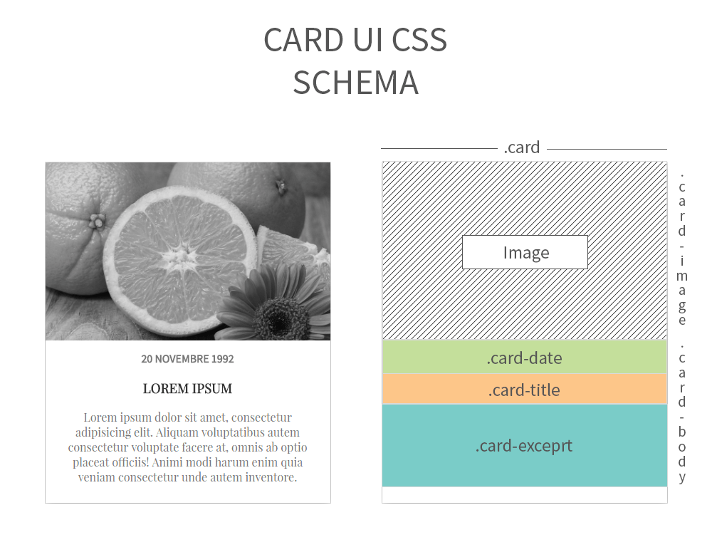
Before writing a line of HTML, picture the structure. When you are working from a mock-up, take the time to think through the structure of your site and of your CSS modules. Sketch it on a sheet of paper if that helps. Well-structured HTML makes everything that follows easier!
<div class="card">
    <a href="https://www.gekkode.com/en/blog/post/#">
        <!-- Image à la une -->
        <div class="card-image"><img src="https://www.gekkode.com/wp-content/uploads/2021/08/orange.jpeg" alt="Orange" /></div>
        <!-- Fin de l'image à la une -->

<!-- Corp de notre carte -->
        <div class="card-body">

<!-- Date de publication de l'article-->
            <div class="card-date">
                <time>20 Novembre 1992</time>
            </div>

<!-- Titre de l'article -->
            <div class="card-title">
                <h3>Lorem Ipsum</h3>
            </div>
            <!-- Extrait de l'article -->
            <div class="card-excerpt">
                <p> Lorem ipsum dolor sit amet, consectetur adipisicing elit. Aliquam voluptatibus autem consectetur voluptate facere at, omnis ab optio placeat officiis! Animi modi harum enim quia veniam consectetur unde autem inventore.</p>
            </div>

</div>
        <!-- Fin du corp de notre carte -->
    </a>
</div>
Step 2 – Set the base rules and style the module
Once the HTML skeleton is in place, we move on to the CSS, taking each part of the sketch in turn.
The same styles work just as well in SCSS, with a variable for the shadow colour and nesting for the hover state. That does add a compilation step: see compiling SCSS in a Webpack build.
.card
.card {
  width: 400px; /*1*/
  margin: 0px auto; /*2*/
  background-color: white; /*3*/
  box-shadow: 0px 5px 20px #999; /*4*/
}
.card a { /*5*/
  color: #333;
  text-decoration: none;
}
.card:hover .card-image img { /*6*/
  width: 160%;
  filter: grayscale(0);
}- We give the card a fixed width.
- We centre it with
margin: 0px auto, make sure the element really isdisplay: block. - We make it white; I put a slightly darker background on the
bodyso the card stands out from the page. - We add a soft shadow so the card looks like it sits above the page.
- We set the base style of the links inside the
.cardmodule. - For the movement mentioned earlier, we tell the browser that as soon as the visitor hovers the card, the image grows through
widthand gets its colours back, since a black-and-white filter is applied by default on.card-image.
.card-image
.card-image {
  height: 250px;/*1*/
  position: relative;/*2*/
  overflow: hidden;/*3*/
}
.card-image img {
  width: 150%;/*4*/
    /*5 - Centring method based on the size of the image */
  position: absolute;
  top: 50%;
  left: 50%;
  transform: translate(-50%, -50%);
  filter: grayscale(1);/*6*/
    /*7 - Transition */
  transition-property: filter width;
  transition-duration: .3s;
  transition-timing-function: ease;
}- We fix the height of the block that holds the image, that fixed size keeps every image the same when several cards sit next to each other.
- We set the element to
relative, because it will containabsoluteelements. - We hide anything that overflows the block.
- We set the image size to 100%. You can raise that default to suit your needs, but do not use images narrower than 400px, and keep the width/height ratio so you do not end up with empty space.
- This is the way to centre an image against its own size and its parent. The idea is to put its origin at the centre of
.card-image, then usetransformto shift it back by half its own size so it sits exactly in the middle of.card-image. - The
filterproperty applies a filter to an image, here we want a black-and-whitegrayscalefilter by default, so that the colours can come back when the user hovers the card. - For the movement, we put a 300ms transition on both
filterandwidth.
.card-body
.card-body {
    text-align:center;  /*1*/
  padding: 15px 20px; /*2*/
  box-sizing: border-box; /*3*/
}- We align everything inside
.card-body. - To stop the content touching the edges, we add breathing room with the
paddingproperty. - Then, if it is not already the default, we set
box-sizingtoborder-boxso the padding is counted inside the block rather than added to it.
Typography
.card-date {
  font-family: 'Source Sans Pro', sans-serif;
}

.card-title, .card-excerpt {
   font-family: 'Playfair Display', serif;
}

.card-date, .card-title {
  text-align:center;
  text-transform:uppercase;
  font-weight: bold;
}

.card-date, .card-excerpt {
  color: #777;
}
As you would expect, this is where the text style is set: I used Source Sans Pro as the sans-serif and Playfair Display as the serif, plus a few formatting tweaks for the text.