Flexbox ou Grid ? La règle en une phrase
Watch the ShortThe Gekkode YouTube channel publishes more videos about AI and code.
Subscribe to support the channelCSS Grid and Flexbox are two CSS layout methods for building complex, flexible designs on the web. They overlap in places, but each has its own features and its own ideal use cases. In this CSS Grid vs Flexbox comparison, we will go through the strengths and weaknesses of each, and see when one is the better choice over the other.
Display Grid
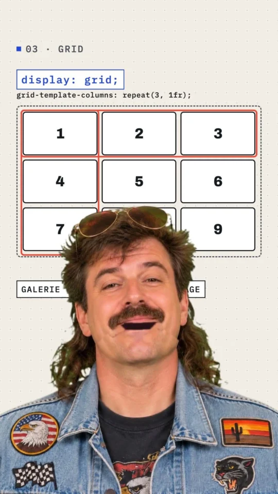
Display Grid is a layout system designed for grid-based designs. It lets you define rows and columns on your page and place elements inside those rows and columns. That means you can easily align and organise the elements of your page in a consistent, structured way.
Here is an HTML/CSS example that uses CSS Grid to create a grid of 3 columns and 3 rows:
Grid HTML code
<div class="grid-container">
  <div class="grid-item">1</div>
  <div class="grid-item">2</div>
  <div class="grid-item">3</div>
  <div class="grid-item">4</div>
  <div class="grid-item">5</div>
  <div class="grid-item">6</div>
  <div class="grid-item">7</div>
  <div class="grid-item">8</div>
  <div class="grid-item">9</div>
</div>
Grid CSS code
.grid-container {
    display: grid;
    grid-template-columns: repeat(3, 1fr);
    grid-template-rows: repeat(3, 1fr);
    gap: 1rem;
    border: 1px dashed #000;
    padding: 5px;
}

.grid-item {
    background: #e74c3c;
    padding: .5rem;
    color: white;
    text-align: center;
}
Display Flex
Flexbox is a layout system designed for flexible layouts that adapt to varying screen and container sizes. It lets you set relative dimensions for the elements of your layout and align them precisely.
Another HTML/CSS example, this time using Flexbox to align:
Flex HTML code
<div class="flex-container">
  <div class="flex-item">Logo</div>
  <div class="flex-item">Menu</div>
  <div class="flex-item">Champ de Recherche</div>
</div>
Flex CSS code
.flex-container {
  display: flex;
  justify-content: center;
  gap: 1rem;
  border: 1px dashed #000;
  padding: 5px;
}

.flex-item {
    border: 1px dashed #e74c3c;
    padding: 10px;
}
Flexbox and Grid compared
CSS Grid vs Flexbox: here is the same markup, this time with Grid. The difference in the relative size of the elements speaks for itself.
Grid vs Flex HTML code
<div class="grid-container">
  <div class="grid-item">Logo</div>
  <div class="grid-item">Menu</div>
  <div class="grid-item">Champ de Recherche</div>
</div>The large gap between the example and the HTML code is not a bug in your browser. We told our grid to use 3 columns and 3 rows, so the grid sticks to that structure whatever happens. Display Grid follows the structure declared in CSS to the letter, even when there is no .grid-item child at all!
CSS Grid or Flexbox: when to use which?
Understanding the strengths and weaknesses of each tool is what lets you pick the one that fits your project. Broadly, CSS Grid is ideal for grid-based designs, such as portfolios and image galleries, while Flexbox is ideal for flexible, responsive designs, such as flex menus and toolbars.
Here is an example to make it clearer. Say you want to build the layout for the home page of an e-commerce site. That layout has to hold featured product images, sections for product categories, a navigation bar and a search form. In that case, you could use CSS Grid to arrange the featured product images in a grid, and Flexbox to align the product category sections, the navigation bar and the search form efficiently.
The two tools can also be used together to build even more advanced designs. You could use CSS Grid to create a grid of columns and rows, then use Flexbox to align the elements inside each cell of that grid. That way you combine the advantages of both tools into designs that are more powerful and more flexible.
In short, CSS Grid is the right tool for grid-based designs such as portfolios and image galleries, while Flexbox is the right tool for flexible, responsive designs such as flexbox menus and toolbars. Using the two together lets you build more advanced designs to match whatever your project needs.