Positioning elements has always been a real headache, even with the layout systems we had along the way: block, inline-block, table and the rest. Floats or inline-block, it hardly mattered, running into trouble was the norm. Things have moved on, though, and now that old browsers such as Internet Explorer are being dropped, we can start aligning our elements with the Flexbox module. In this tutorial I will show you how easy it is to build a menu in a handful of lines.
Step 1 – The base
Before writing any CSS, let us lay down the base of our menu in HTML5.
<nav class="nav" role="navigation">
    <ul clas="menu">
        <li><a href="https://www.damienflandrin.fr/blog/post/#">Accueil</a></li>
        <li><a href="https://www.damienflandrin.fr/blog/post/#">Catégories</a></li>
        <li><a href="https://www.damienflandrin.fr/blog/post/#">À Propos de Moi</a></li>
        <li><a href="https://www.damienflandrin.fr/blog/post/#">Contact</a></li>
    </ul>
</nav>
We then apply some basic styling to the menu:
.nav ul {
    margin: 0px;
    padding: 0px;
    background: tomato;
    list-style:none;
}

.nav a {
    padding: 1em;
    display: block;
    text-align:center;
    text-decoration: none;
}
Step 2 – The menu
Now that our elements have their basics, we can get to work on the menu itself.
.nav .menu {
    display: flex; /*1*/
    flex-direction : row; /*2*/
    justify-content: center; /*3*/
}- 1 – We switch the display to flexbox.
- 2 – With flex-direction, we ask for the children of the current element to be laid out in a row.
- 3 – justify-content lets us align the children to the left, the centre or the right of the current element

In three lines you have the beginnings of a menu. Need it pushed to the right? Just set flex-end on the justify-content property. Want to reverse the row? Set row-reverse on flex-direction. Flexbox is not only simpler, it is also very flexible. And what if I told you the mobile version takes a single line?
.nav .menu {
    display: flex; /*1*/
    flex-direction : row; /*2*/
    justify-content: center; /*3*/

@media(max-width: 450px) {
      flex-flow: column wrap; /*4*/
    }
}- 4 – At a mobile resolution, flex-flow, a shorthand for flex-direction and flex-wrap, lays the children out in a column and allows wrapping.

And there you have it. All right, three lines really, but stopping here already gives us a first basic version of our responsive menu. As you know, there are submenus too, and that is what we will look at in the next step.
See the Pen Menu responsive avec Flexbox – 1 by Damien Flandrin (@dam62500) on CodePen.
Step 3 – Submenus
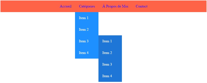
To build a submenu we create two classes: has-children, which goes on a menu item that carries a submenu, and the sous-menu class.
<!-- notre menu flexbox -->
    <nav class="nav" role="navigation">
        <ul class="menu">
            <li><a href="https://www.damienflandrin.fr/blog/post/#">Accueil</a></li>
            <li class="has-children"><a href="https://www.damienflandrin.fr/blog/post/#">Catégories</a>
                <!-- sous menu-->
                <ul class="sous-menu">
                    <li><a href="https://www.damienflandrin.fr/blog/post/#">Item 1</a></li>
                    <li><a href="https://www.damienflandrin.fr/blog/post/#">Item 2</a></li>
                    <li class="has-children"><a href="https://www.damienflandrin.fr/blog/post/#">Item 3</a>
                        <!-- un sous menu dans un sous-menu-->
                        <ul class="sous-menu">
                            <li><a href="https://www.damienflandrin.fr/blog/post/#">Item 1</a></li>
                            <li><a href="https://www.damienflandrin.fr/blog/post/#">Item 2</a></li>
                            <li><a href="https://www.damienflandrin.fr/blog/post/#">Item 3</a></li>
                            <li><a href="https://www.damienflandrin.fr/blog/post/#">Item 4</a></li>
                        </ul>
                        <!-- /un sous menu dans un sous-menu-->
                    </li>
                    <li><a href="https://www.damienflandrin.fr/blog/post/#">Item 4</a></li>
                </ul>
                <!-- /sous menu-->
            </li>
            <li><a href="https://www.damienflandrin.fr/blog/post/#">À Propos de Moi</a></li>
            <li><a href="https://www.damienflandrin.fr/blog/post/#">Contact</a></li>
        </ul>
    </nav>
<!-- /notre menu flexbox -->
For my example I decided to put a submenu inside a submenu (inception!), since that case comes up often enough.
  .has-children { /*1*/
    position: relative;
  }

.has-children:hover > .sous-menu { /*2*/
    display: flex;
  }

.sous-menu { /*3*/
    display: none;
    flex-flow: column wrap;
    min-width: 100px;
    position: absolute;
    background: dodgerblue;
  }

.sous-menu a { /*4*/
    text-align: left;
    color:white;
  }

.sous-menu .sous-menu { /*5*/
    top: 0px;
    left: 100%;
    background: #1e76d6;
}- 1 – We position the element relatively so the submenu can be aligned against its parent.
- 2 – When the cursor is over an item that carries a submenu, we display that submenu in flexbox mode.
- 3 – We define the default behaviour of the submenu: hidden to begin with, laid out in a column, with a minimum width of 100 px (not compulsory, but in my example the submenu would otherwise be ridiculously small).
- 4 – We align the text to the left, purely for looks.
- 5 – We align the nested submenu at the same height as its parent and to its right (right: 0 px; would not work in this kind of case).
And the responsive variant:
.sous-menu {
    display: none;
    flex-flow: column wrap;
    min-width: 100px;
    position: absolute;
    background: dodgerblue;
    @media(max-width: 450px) {
      position: static;
    }
}

.sous-menu.is-active {
        display: flex!important;
}

.sous-menu a { /*4*/
    text-align: left;
        @media(max-width: 450px) {
      text-align: center;
    }
    color:white;
  }

.sous-menu .sous-menu {
    top: 0px;
    left: 100%;
    background: #1e76d6;
}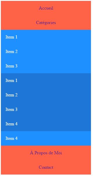
Lean on JavaScript for your interactions with mobile and tablet users, and I would add: build a sliding menu if you have submenus. I did not do one in this tutorial, but it is far more comfortable for your visitors.
$('.sous-menu').click(function(){
    if ($(window).width() < 450) {
        if($(this).hasClass('is-active'))
            $(this).removeClass('is-active');
        else
            $(this).addClass('is-active');
    }
});
See the Pen Menu responsive avec Flexbox – 2 by Damien Flandrin (@dam62500) on CodePen.
Flexbox browser support
Flexbox is rather well supported across browsers, but there are still a few things to know to get that support right. Today we can start planning on Flexbox, and there is no doubt that in a few years we will see its use grow a great deal, even among the best known frameworks such as Bootstrap and Foundation.
| Internet Explorer | Firefox | Chrome | Safari | Android |
|---|---|---|---|---|
Supported from Internet Explorer 10 with its -ms- prefix, no prefix beyond 10. | Firefox 19 to 21, use its -moz- prefix, no prefix beyond 21 | Up to version 28 with -webkit-, no prefix beyond 28 | Up to 10 with -webkit-, no prefix beyond that | With -webkit- up to version 4.3, no prefix beyond that |